2020 Maps Of The Week
OUR MAP OF THE WEEK HIGHLIGHTS NOTEWORTHY MAPPING WORK FROM A VARIETY OF FIELDS.
CHECK HERE EACH WEEK FOR A NEW MAP!
1 DECEMBER 2020: countries reporting on antiretroviral disruptions due to covid-19
source: WORLD HEALTH ORGANIZATION (WHO)
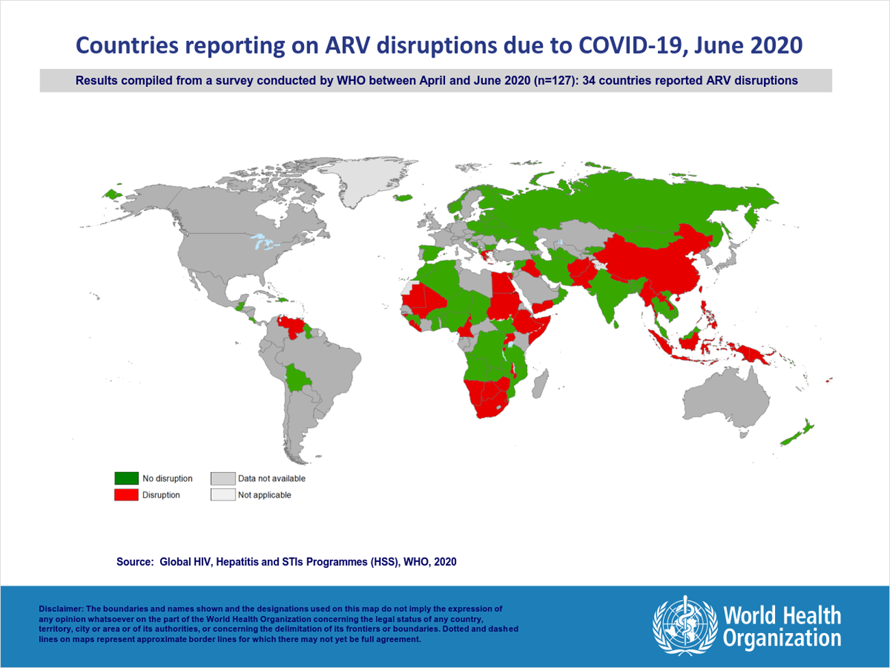
Map & Data: World Health Organization (@WHO)
Beyond The Map: World AIDS Day
On 1 December WHO is calling on global leaders and citizens to rally for “global solidarity” to maintain essential HIV services during COVID 19 and beyond - and to ensure continued provision of HIV services for children, adolescents and populations most at risk for the disease. The Organization also calls on countries to provide health workers with greater protection and support so they can continue their work safely during the pandemic.
Protecting people from HIV during the pandemic, and ensuring they can maintain treatment, is critical. Researchers are currently investigating whether people with HIV have an increased risk of poor outcomes with COVID-19. Preliminary evidence of a moderate increased vulnerability of people with HIV makes it even more urgent that people with HIV have access to antiretrovirals (ARVs) and treatments for co-morbidities – such as treatment for non communicable diseases (NCDs), chronic obstructive pulmonary disease (COPD), diabetes and tuberculosis.
WHO and partners sounded the alarm earlier this year, concerned at the impact of reported disruptions in service delivery. But now, thanks to the unstinting work of health and community workers, the number of countries reporting disruptions in HIV services has declined by almost 75% since June. Only 9 of the 152 countries surveyed are still reporting disruptions (maps: June 2020 - November 2020); and in June, 24 countries reported less than 3 months supply of ARVs, while now only 12 report a critically low stock.
This is mainly due to the implementation of existing guidelines, including providing multi-month dispensing (MMD) of ARVs for 3-6 months to patients who did not have access to health facilities; strong WHO-led global, regional, country, manufacturer and partner coordination to ensure adequate supply of drugs stocks, and sustained provision of facility-based essential health services and community delivery mechanisms.
But countries have also introduced a number of effective adaptations and innovations in service delivery during COVID-19. These include:
In many countries in sub-Saharan Africa, testing for COVID-19 has heavily relied on the laboratory systems built and developed by HIV and TB programs. Devices have been shared across programs as well as infrastructure, sample transport systems, and highly skilled staff.
In Thailand, PrEP services have been delivered through key population led health services providing multi-month dispensing, telehealth, Xpress service, self-sampling, and counselling.
In Bulgaria, a demonstration project showed strong community demand for HIV self-testing which also led to expansion of testing services to reduce inequalities between rural and urban areas.
“On World AIDS Day 2020, we pay tribute to the communities and countries who have shown resilience and innovation - often spearheaded by people themselves living with HIV,“ says Dr Meg Doherty, Director of WHO’s Department of Global HIV, Hepatitis and STI Programmes. “This is vital, because while we focus on fighting this new pandemic, we must not drop our guard on a twin pandemic that has been with us for 40 years and which is far from over."
Progress towards global targets for diagnosis and treatment has slowed down considerably this year.
New data shows that an estimated 26.0 million people were on antiretroviral treatment as of mid-2020, up only 2.4% from an estimate of 25.4 million at the end of 2019. This increase is too slow by comparison to last year where treatment coverage increased by an estimated 4.8% between January and June of 2019. Among 24 countries with monthly data reported to UNAIDS and WHO, people currently on treatment have been supported and maintained, but testing has declined in all and newly enrolled on treatment has been halved. In the last few months; however, there positive signs of rebound in testing and treatment services.
WHO hopes that some of the innovative approaches adopted during COVID-19 can help the world catch up and accelerate progress towards our new 2025 targets and the SDG goals of ending AIDS as a public health threat by 2030.
26 NOVEMBER 2020: MAPPING THE THANKSGIVING HARVEST
source: ESRI
Map: Esri (@Esri)
Data: US Department of Agriculture (USDA) National Agricultural Statistics Service (NASS)
Website: https://youtu.be/BytJjBYssTo
Beyond The Map: Mapping the Thanksgiving Harvest StoryMap
Millions of Americans gather each November to celebrate family solidarity and enjoy a calorie-laden feast. But have you ever contemplated the origins of the heaps of vegetables, fowl, and sweets that we pass around the table?
The maps presented here reveal a surprising diversity of patterns and concentrations. We hope that they'll elicit an appreciation for the farmers who nurture this cornucopia, and the distribution systems that bring them to your table.
This animated map was made using Esri's ArcGIS Pro, Cinema 4D, Arnold, and Adobe After Effects.
Please visit http://ow.ly/fm2950xgu0B for more information about ArcGIS Pro.
Music: Toy Symphony by Nir Maimon
24 NOVEMBER 2020: Share of people eating Thanksgiving dinner with people outside their household
source: The New York Times

Map & Data: Josh Katz (@jshkatz), Kevin Quealy (@KevinQ), Margot Sanger-Katz (@sangerkatz) / New York Times (@nytimes)
Website: https://www.nytimes.com/interactive/2020/11/24/upshot/thanksgiving-dinner-survey.html
Beyond The Map: What 635 Epidemiologists are Doing for Thanksgiving
Public health officials have been pleading with Americans to stay home this year for Thanksgiving. And, despite busy airports this past weekend, most people plan to follow their advice, according to a huge survey asking Americans about their holiday plans.
The map shows the geographic variation in those plans, and there are partisan splits, too. But even among Republicans, two-thirds are forgoing a large traditional Thanksgiving.
Our data comes from interviews conducted by the global data and survey firm Dynata at the request of The New York Times. The firm asked a question about Thanksgiving plans, obtaining more than 150,000 survey responses from Nov. 13-23, enough data to provide estimates more detailed than at the state level.
Nationwide, the survey found that only around 27 percent of Americans plan to dine with people outside their household. That number is roughly consistent with the results of several recent smaller surveys, including those from YouGov, the Covid States Project and researchers at Ohio State University, which all find fewer than a third of Americans plan to celebrate in groups.
18 NOVEMBER 2020: 2020 Indigenous Mapping WOrkshop global map of participants
source: indigenous mapping workshop
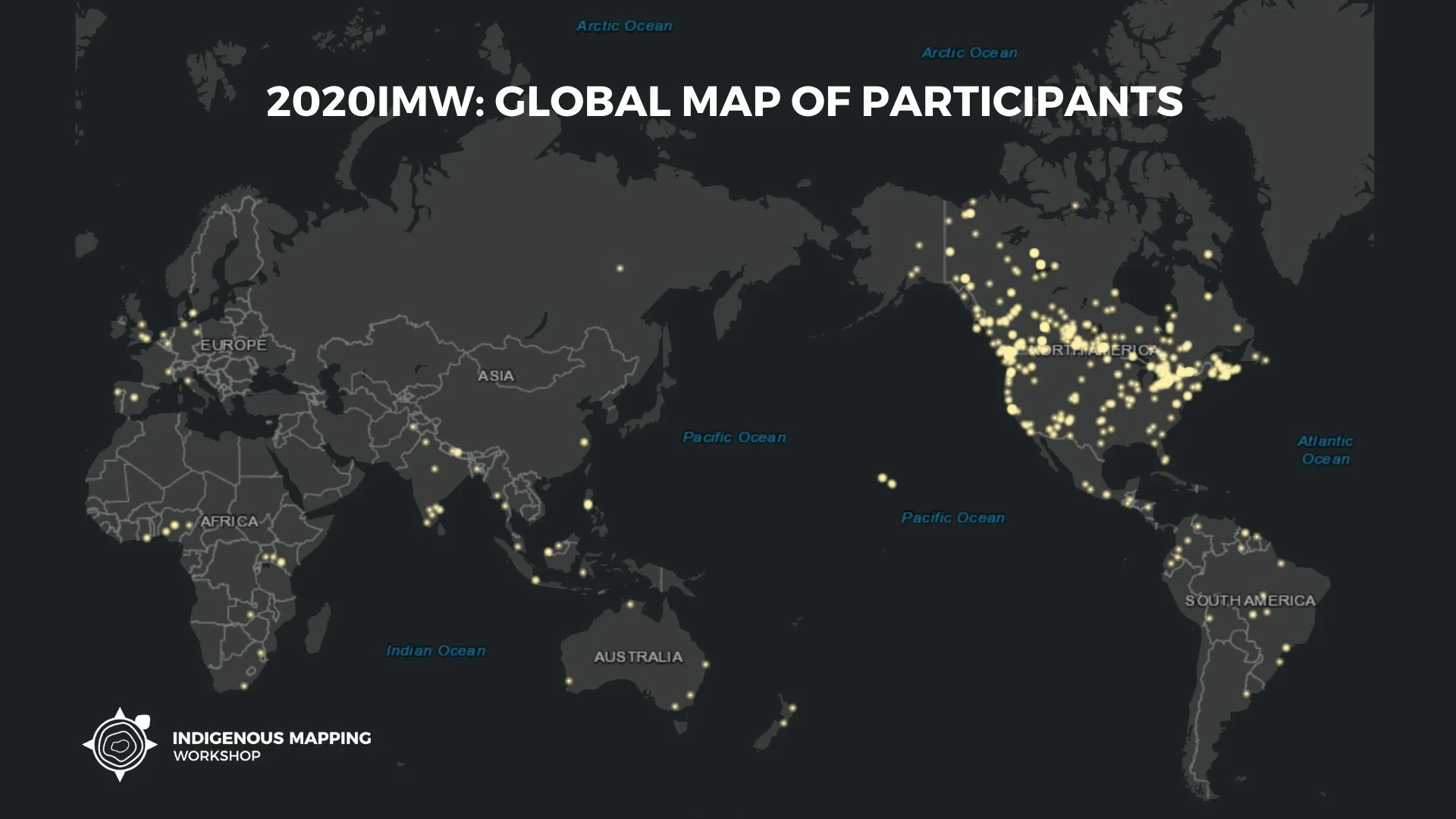
Map & Data: Indigenous Mapping Workshop (@indigenousmaps)
Website: https://www.indigenousmaps.com/2020imw/
Beyond The Map: The Firelight Group
Introducing the very first Virtual Indigenous Mapping Workshop. For the first time ever, IMW participants can develop their skills, with cutting edge geospatial technologies, from anywhere around the globe. Learn to redefine Indigenous landscapes from Indigenous mapping experts. Develop hands-on skills from leading industry professionals including Esri, Google, NASA, Mapbox and more. Join the Indigenous Mapping Collective and have unprecedented access to all IMW course materials and exclusive new content posted throughout the year.
The Firelight Group and its partners are proud to present the largest international geospatial conference for Indigenous Nations and organizations on Indigenous-led geospatial research. The Indigenous Mapping Workshop is composed of GIS, capacity building, education specialists, and Indigenous community partners. The Planning Committee is responsible for all levels of event logistics, management, and curriculum development.
Since 2014, the Indigenous Mapping Workshop has trained over 1000 Indigenous community mappers on emerging geospatial tools and technologies. With the dedication of our partners and sponsors, the Indigenous Mapping Workshop has become the largest global Indigenous geospatial network.
11 NOVEMBER 2020: percentage of veterans among the civilian population, 18 years and older, united states
source: United states census bureau

Map: United States Census Bureau (@uscensusbureau)
Data: 2019 American Community Survey
Website: https://www.census.gov/
Beyond The Map: US Library of Congress Veteran’s History Project
Veterans Day originated as “Armistice Day” on Nov. 11, 1919, the first anniversary marking the end of World War I. Congress passed a resolution in 1926 making it an annual observance, and it became a national holiday in 1938. Then-President Dwight D. Eisenhower signed legislation in 1954 to change the name to Veterans Day to honor all those who served the country in war or peace. On this day, the nation honors military veterans with parades and other observances across the country and a ceremony at the Tomb of the Unknowns at Arlington National Cemetery in Virginia.
The following facts are possible thanks to the invaluable responses to U.S. Census Bureau surveys. We appreciate the public’s cooperation in helping us measure America’s people, places and economy.
Veteran Population
Did You Know?
17.4 million: The number of military veterans in the United States in 2019.
1.6 million: The number of female veterans in the United States in 2019.
12.3%: The percentage of veterans in 2019 who were Black. Additionally, 76.2% were non-Hispanic White; 1.8% were Asian; 0.8% were American Indian or Alaska Native; 0.2% were Native Hawaiian or Other Pacific Islander; and 1.4% were some other race. (The numbers cover only those reporting a single race.)
7.2%: The percentage of veterans in 2018 who were Hispanic.
50.4%: The percentage of veterans age 65 and older in 2019. At the other end of the age spectrum, 8.4% were younger than age 35.
Source: 2019 American Community Survey
More on Veterans
Click on the button below for a detailed profile on the veteran population from the 2019 American Community Survey. Statistics include:
When veterans served.
Demographics – age, sex, race and Hispanic or Latino origin.
Median income.
Educational attainment.
Employment status.
Poverty status.
Disability status.
3 NOVEMBER 2020: 2020 US presidential ELECTION INTERACTIVE forecast
source: fivethirtyeight.com
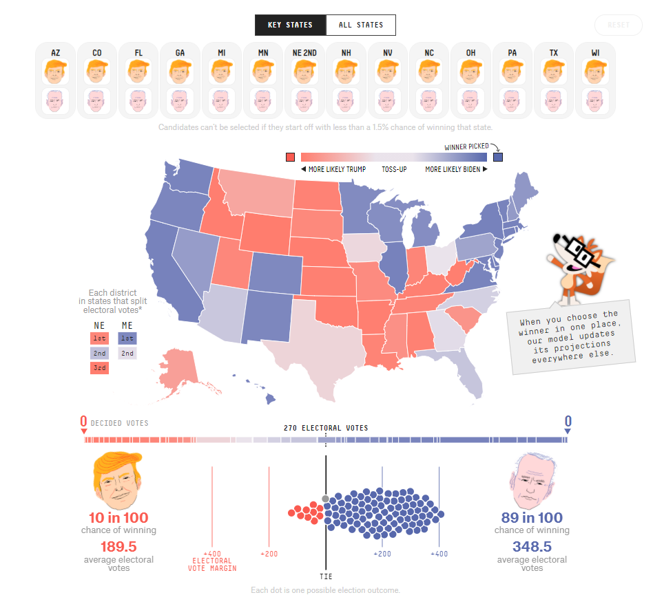
Map: FiveThirtyEight.com (@FiveThirtyEight)
Website: https://projects.fivethirtyeight.com/trump-biden-election-map/
Beyond The Map: How FiveThirtyEight’s 2020 Presidential Forecase Works - And What’s Different Because Of COVID-19
How this works: We start with the 40,000 simulations that our election forecast runs every time it updates. When you choose the winner of a state or district, we throw out any simulations where the outcome you picked didn’t happen and recalculate the candidates’ chances using just the simulations that are left. If you choose enough unlikely outcomes, we’ll eventually wind up with so few simulations remaining that we can’t produce accurate results. When that happens, we go back to our full set of simulations and run a series of regressions to see how your scenario might look if it turned up more often.
In simplified terms, the regressions start off by looking at the vote share for each candidate in every simulation and seeing how the rest of the map changed in response to big or small wins. So let’s say you picked Trump to win Texas. In some of our simulations, Trump may have won Texas very narrowly and also have narrowly lost some toss-up states. But in simulations where he won Texas by a big margin, he may also have won big in toss-up states and pulled some Democratic-leaning states into his column, while the reverse may be true in simulations where he lost the state. We figure out how every other state tended to look in that full range of scenarios, tracking not just whether the candidate usually won other states but also how much he generally won or lost each one by.
After all that, we take some representative examples of scenarios that include the picks you made and use what we learned from our regression analysis to adjust all 40,000 simulations, and then recalculate state and national win probabilities. Finally, we blend those adjusted simulations with any of the original simulations that still apply and produce a final forecast.
*Maine and Nebraska award two electoral votes to the winner of the statewide race and one electoral vote to the winner of each congressional district.
31 october 2020: Every Country’s Most Famous Mythical Creature
source: SAVINGSPOT of CASHNETUSA
Map: SavingSpot of CashNetUSA (@CashNetUSA)
Website: https://www.cashnetusa.com/blog/every-countrys-most-famous-mythical-creature/
Beyond The Map: Monsters and Mythical Creatures from Around the World
The Sasquatch. Baba Yaga. Curupira. They are all bizarre creatures who have been widely claimed to exist – although nobody has delivered proof. That makes them cryptids and consigns them to the realm of pseudoscience. But it doesn’t mean they’re not real.
Every culture is riddled with unconscious fears and shared hang-ups. When a sequence of strange events occurs, it doesn’t take long for someone to conjure a scapegoat whose weird characteristics fit the crime. If the scapegoat catches the imagination of the locals, the legend grows and mutates over the weeks, years, and centuries. The cryptid lives and breathes in the minds of those who believe and those who say they don’t.
A while back, CashNetUSA showed you the most famous cryptid in every US state. But now we’ve extended our search, identifying the most popular mythical creature in every country of this weird old planet of ours.
We trawled bestiaries and encyclopedias such as Monsters and Mythical Creatures from Around the World and longlisted every country’s “who’s who” of cryptids. Then we crunched the numbers on Google to see which creatures were the most-searched in each location.
Sometimes, multiple countries shared the same cryptid. In these cases, we paid special attention to the fine details reported by the spooked ancestors and trembling tourists that have come into contact with them over the years. For example, the English dragon is winged and lizard-like, while the Chinese dragon is wingless and snakeish.
Finally, we worked with illustrator Laimute Varkalaite to create a series of maps showing the most notorious cryptid in every country on earth: the mythical creatures that refuse to properly not exist.
Key Findings
The most famous mythical creature in the US is the Sasquatch, a hairy, forest-dwelling humanoid.
The most famous in North America is Cuba’s Madre de Aguas, a horned, bullet-proof snake as fat as a palm tree.
South America’s most famous cryptid is La Tunda, a hag with the power to shapeshift into the object of your desire (before sucking your blood).
Dragons are the most-searched cryptids for a European country (England).
The Turkish dragon is the most-searched in the Middle East & Central Asia region, with the Egyptian griffin (a lion with the head and wings of an eagle) in second-place.
The Chinese dragon is the most-searched in the Rest of Asia and Oceania, followed by the cunning, ape-like Orang Pendek (Indonesia).
The most famous cryptid in Africa is the Namibian Flying Snake.
15 SEPTEMBER 2020: Distribution of the u.s. hispanic population by counties, 2015
source: Instituto Cervantes at Harvard University
Map: Insituto Cervantes at Harvard University
Data: American Community Survey (ACS)
Website: http://cervantesobservatorio.fas.harvard.edu/sites/default/files/hispanic_map_2017en.pdf
Beyond The Map: Hispanic Heritage Month 2020
The counties with the largest Hispanic population tend to be concentrated in the Southwest of the country and also in Southern Florida New Mexico has the largest number of Hispanics as a portion of the overall population, at 48.5%, while California has the largest overall number of Hispanics, at 15,3 million (U.S. Census Bureau/American FactFinder 2016: PEPASR6H). From 2000-2010, the Hispanic population has grown most rapidly in the South and in the Midwest (Hispanic Association of Colleges and Universities 2017). Northeastern counties, predominately those in Pennsylvania, New Jersey and New York, demonstrated a larger share of national Hispanic growth post-2007 than during the period 2000-2007 (Stepler and Lopez 2016). Notably, the three counties demonstrating the greatest growth in their Hispanic population were all found in North Dakota.
In 2016, the five U.S. states with the largest Hispanic population were: California (15.3 million), Texas (10.9 million), Florida (5.1 million), New York (3.7 million) and Illinois (2.2 million) (U.S. Census Bureau/American FactFinder 2016: PEPASR6H). The states where Hispanics made up the largest share of the population (in 2016) were: New Mexico (48.5%), Texas (39.1%), California (38.9%), Arizona (30.5%) and Nevada (28.5%) (U.S. Census Bureau/American FactFinder 2016: PEPASR6H). More than 50% of U.S. Hispanics live in California, Florida and Texas; adding New York, Arizona, Illinois, New Jersey and Colorado to the group incorporates over 75% of all Hispanics in the United States (Hispanic Association of Colleges and Universities 2017). Between 2000 and 2015, the states with the fastest-growing Hispanic populations were Georgia (118.8%), Florida (85.6%), Texas (60.4%), Arizona (62.4%) y Colorado (58.4%) (Flores 2017).
U.S. Hispanics trace their heritage to more than twenty Spanish-speaking countries. Of these groups, six have populations in the U.S. greater than one million. Arrivals and descendants from 14 countries (noted in Table 4 of the report link below) account for 95% of the U.S. Hispanic population.
9 SEPTEMBER 2020: Colleges with coronavirus cases since the pandemic began
source: The NEW YORK TIMES

Map: The New York Times (@nytimes)
Data: New York Times survey of more than 1,500 American colleges and universities
Website: https://www.nytimes.com/interactive/2020/us/covid-college-cases-tracker.html
Beyond The Map: COVID in the U.S.:Latest Map and Case Count
As colleges start the academic year amid a pandemic, coronavirus cases are turning up by the thousands.
A New York Times survey of more than 1,500 American colleges and universities — including every four-year public institution, every private college that competes in N.C.A.A. sports and others that identified cases — has revealed at least 51,000 cases and at least 60 deaths since the pandemic began.
More than 100 colleges have reported at least 100 cases over the course of the pandemic, including dozens that have seen spikes in recent weeks as dorms have reopened and classes have started. Many of the metro areas with the most cases per capita in recent days — including Auburn, Ala.; Ames, Iowa; and Statesboro, Ga. — have hundreds of cases at universities.
A cluster of 44 cases in the Virginia Commonwealth athletic department forced the university to find additional isolation space. As cases mounted on campus, Iowa State scrapped plans to allow 25,000 fans to attend their first home football game. And California State University, Chico, sent students home to take online classes after dozens of cases emerged, including at least one in almost every dorm.
“I, like you, wish the story of this semester had been much different,” Gayle Hutchinson, the university’s president, wrote in a letter announcing the decision.
NATIONAL
At least 1,176 new coronavirus deaths and 33,201 new cases were reported in the United States on Sept. 9. Over the past week, there have been an average of 36,733 cases per day, a decrease of 13 percent from the average two weeks earlier.
As of Thursday morning, more than 6,378,900 people in the United States have been infected with the coronavirus and at least 190,700 have died, according to a New York Times database.
Case numbers remain persistently high across much of the country, though reports of new cases have dropped considerably since late July, when the country averaged well over 60,000 per day.
But as many of the country’s most populous states saw vast improvement, and as the Northeast kept case reports low, new infections were rising by late summer across parts of the Midwest and South.
Deaths, though still well below their peak spring levels, averaged around 850 per day in early September, far more than were reported in early July.
American life has been fundamentally reordered because of the virus. Concerts, parades and high school football games continue to be called off. Countless people have found themselves jobless and struggling to afford housing. Many schools and colleges will hold few or no in-person classes this fall. More than 51,000 cases have been linked to colleges and universities over the course of the pandemic.
1 SEPTEMBER 2020: Principal Aquifers of the United States
source: United States Geological survey (USGS)

Map & Data: US Geological Survey (@USGS)
Website: https://water.usgs.gov/ogw/aquifer/USAaquiferMAP11_17.pdf
Beyond The Map: Overview of the Principal Aquifers: Aquifer Basics
GIS files for the map of the principal aquifers of the United States were released as part of the National Atlas, which was discontinued in late 2014. The National Atlas included two nationwide maps of principal aquifers:
Principal Aquifers of the United States, and
Aquifers of Alluvial and Glacial Origin north of the line of continental glaciation.
The geosptial files below were downloaded from the National Atlas by the USGS Office of Groundwater in September 2014. The geospatial data files were not updated or revised and reflect their original content from when they were published in 2002 and 2003. For information about how the geospatial data files were originally generated, refer to the metadata files.
More recent geospatial data are available for selected principal aquifers as the result of recent and ongoing regional groundwater availability studies investigated by the Groundwater Resources Program (GWRP) to improve our understanding of groundwater availability in major aquifers across the Nation.
Principal Aquifers of the United States
This dataset, published in 2003, contains the shallowest principal aquifers of the conterminous United States, Hawaii, Puerto Rico, and the U.S. Virgin Islands, portrayed as polygons. The map layer was developed as part of the effort to produce the maps published at 1:2,500,000 in the printed series Ground Water Atlas of the United States. The published maps contain base and cultural features not included in these data.
Please note that the maps do not show the entire extent of an aquifer, only its subcrop or outcrop area. Refer to the metadata for a complete description of the files and how they were generated.
26 AUGUST 2020: Hurricane Laura, Gulf coast, united states
source: nasa earth observatory

Map & Data: NASA Earth Observatory (@NASAEarth)
Website: https://earthobservatory.nasa.gov/images/147169/a-dangerous-storm-nears-the-gulf-coast
Beyond The Map: How to help those affected by Hurricane Laura
Government meteorologists issued unusually dire warnings as a large hurricane neared the U.S. Gulf Coast on August 26, 2020. After rapidly strengthening as it passed across the Gulf of Mexico, Hurricane Laura was poised to make landfall near the border between Texas and Louisiana. The category 4 storm was expected to unleash strong winds, heavy rains, and a potentially catastrophic storm surge on an area that has not taken a direct hit from a category 4 or 5 storm since the start of modern hurricane records.
The Moderate Resolution Imaging Spectroradiometer (MODIS) on NASA’s Terra satellite acquired a natural-color image (above) of Laura on August 26 at 12:20 p.m. as the storm neared the coast. The storm will make landfall late in the evening on August 26, before marching up the Mississippi Valley.
The gravest concern was for a coastal zone extending from Sea Rim State Park, Texas, to Intracoastal City, Louisiana—an area that National Hurricane Center forecasters warned could face a storm surge of 15 to 20 feet (5 to 6 meters) at the coast and flood waters that penetrate as far as 40 miles (60 kilometers) inland.
A storm surge occurs when cyclonic winds from an approaching storm push a wall of extra water onto the shore. The magnitude of a storm surge depends not only on a hurricane’s winds, but also on its speed, size, and the angle at which it approaches the coast. The timing of astronomical high and low tides can also affect the height of a surge. Storm surges are often the greatest threat to life and property from a hurricane.
Hurricane Laura is also expected to deliver destructive winds and rain. Forecasters anticipate that hurricane-force winds will extend as far as 70 miles (100 kilometers) from the storm's center into eastern Texas and western Louisiana. They expect rainfall totals of 5 to 10 inches (13 to 25 centimeters), with up to 15 inches in some areas—enough to cause dangerous flash floods.
19 AUGUST 2020: vote-by-mail rules, united states
source: The Washington Post

Map & Data: The Washington Post (@washingtonpost), Kate Rabinowitz (@dataKateR), Brittany Renee Mayes (@BritRenee_)
Website: At least 77% of American voters can cast ballots by mail in the fall
Beyond The Map: Analysis - Only 372 cases of potential fraud out of roughly 14.6 million ballots cast by mail in 2016 and 2018
As of now, over 180 million Americans who are eligible to vote would be able to cast a ballot by mail. Of those, 25 million live in states that will accept fear of the coronavirus as an excuse to vote absentee, or have switched to become “no excuse” states.
Thirty-four states and the District of Columbia already allowed anyone to vote absentee. But many of these places are making the process easier. California will start proactively mailing ballots to registered voters, joining universal vote-by-mail states such as Colorado. Many states will send every registered voter an absentee-ballot application.
These types of statewide expansions affect another 60 million eligible voters. In Montana, Gov. Bullock has allowed counties to automatically send ballots to registered voters, but not all are electing to do so. Similarly, New Mexico passed legislation that lets county clerks proactively mail applications to vote absentee, but only some will. In some states, like Nebraska, individual counties are expanding access to mail-in voting in absence of a statewide directive.
For voters in seven states, in-person voting remains the only option unless they can provide an approved reason not related to fear of the coronavirus. Traditional absentee excuses include military deployments or illness.
12 AUGUST 2020: Where has covid-19 closed schools? where are they open?, united states
SOURCE: EDUCATION WEEK

Map & Data: Education Week (@educationweek)
Website: Map: Where Are Schools Open?
Beyond The Map: School Districts’ Reopening Plans: A Snapshot
The COVID-19 pandemic is poised to make the 2020-21 school year as challenging—if not more so—than the last. The virus shuttered nearly every school building last spring in a historic disruption of education. Schools were forced to shift to distance learning nearly overnight.
As the coronavirus continues to ravage different regions, K-12 leaders may be forced to close and reopen in waves as infection rates ebb and flow.
This national map will track each state’s mandates or recommendations on K-12 school closures and openings.
As of August 7, 2020, 7 states and Puerto Rico have statewide ordered closures in effect.
Some states may not weigh in at all on school operations, leaving the decisions entirely to local education and public health leaders. As states’ statuses change over the course of the academic year, we will provide updates.
Right now, just a handful of schools have opened, with the vast majority slated to start between mid-August and early September.
5 AUGUST 2020: AAA COVID-19 Travel Restrictions
SOURCE: American automobile association (AAA)

Map: American Automobile Association (@AAAauto) GIS Data Services, The Center for Systems Science and Engineering (CSSE) at Johns Hopkins University (@JHUSystems)
Data: WHO, US CDC, ECDC, NHC, and DXY; national, state, provincial, county, and city governments and Departments of Transportation.
Website: AAA COVID-19 Travel Restrictions
Beyond The Map: AAA Travel
This map contains the most up-to-date information on COVID-19 related travel restrictions within the US and Canada. It also includes COVID-19 case count information by county and state created by Johns Hopkins University. Automation Support: Esri Living Atlas team.
Due to rapid changes at city, county, and state levels, AAA recommends that travelers also review the official websites of the states they'll be visiting to confirm the status of any travel restrictions before leaving for a trip. State websites post the exceptions to travel, quarantine and mask requirements as new information becomes available.
29 JULY 2020: State Approaches to Contact Tracing during the COVID-19 Pandemic
SOURCE: National academy for state health policy (nashp)
Map & Data: National Academy for State Health Policy (@NASHPhealth)
Website: https://www.nashp.org/state-approaches-to-contact-tracing-covid-19/
Beyond The Map: How States Are Ramping Up their COVID-19 Contact Tracing Capacity
To contain the spread of COVID-19, states are rapidly ramping up their contact tracing efforts. Click on a state to learn about its contact tracing program model, lead agencies, tracing process, workforce, technology, and funding, or use the tabs on the left to view states’ approaches by category. For information about the demographics of each state and implications for contact tracing, click here.

Map: Ben Blatt (@BenBlatt)
Data: sports-reference.com
Website: A new U.S. map based on where baseball players were born.
Beyond The Map: I Don’t Care if We Never Get Back: 30 Games in 30 Days on the Best Worst Baseball Road Trip Ever
Another way of seeing the regional imbalance in the production of athletes in different leagues is this fascinating animated GIF created by Slate’s Ben Blatt. Much like the maps that track the country’s shifting population center over time (in other words, the point at which you have equal populations on all sides), this map shows the population centers for each of the four major sports. Hockey’s hugs the Canadian border for pretty much the entire 20th century, while the other three sports’ dive south and west — farther south and west than the US population center, which is in Missouri — showing the disproportionate number of pros born in the Deep South and West Coast.
Ben Blatt: “Historically, the majority of professional hockey players have not been American, and those born in America are often born in the northernmost states. Even though my data includes no one born in Canada, the northern skew actually places the mean center of birth locations in Ontario. (Ontario is south of northern states like Maine, Minnesota, and Alaska, where many players are born.)
And although the mean center for baseball players has shifted from Ohio to Oklahoma, remember that this shift has less to do with those states in particular than with the rise of California, specifically Southern California, as the nation’s hotbed of baseball talent. Dividing the country into 50 equal states based on player birthplace since 1900 results in Southern California being cut into three states. Making the same division, but based on 2014 player birthplaces only, leaves the Los Angeles–San Diego area divided into seven states. Likewise, southern Florida transforms from one state to nearly four.”
15 JULY 2020: 2020 Esri User conference attendees, global
SOURCE: kenneth field / ESRI

Map & Data: Kenneth Field (@kennethfield) & Esri (@Esri)
Website: https://twitter.com/kennethfield/status/1283412321839153152
Beyond The Map: 2020 Esri User Conference
Kenneth Field on Twitter: “I made a map of attendees for this morning's #EsriUC UC Central Live show. 53% of attendees are US based which renders a choropleth or proportional symbol map unsuitable due to the large outlier. But dot density works! 1 dot = 1 person. That's nearly 70,000 randomly placed dots!”
15 JULY 2020: Youth Employment Projects map, global
SOURCE: SOLUTIONS FOR YOUTH EMPLOYMENT (S4YE)

Map & Data: Solutions for Youth Employment (@S4YE_Coalition)
Website: https://s4ye.org/projects/map
Beyond The Map: S4YE Publications & Knowledge Repository
YOUTH UNEMPLOYMENT: ONE OF THE BIGGEST CRISES FACING THE WORLD TODAY
There are 1.8 billion young people living on the planet—with approximately 85% living in developing and emerging economies and in fragile states. Young people account for roughly 40% of the world’s unemployed. They are 4x more likely to be unemployed than adults. 1 in 3 young people worldwide are not in education, employment, or training.
Solutions for Youth Employment (S4YE) is a multi-stakeholder coalition among public sector, private sector, civil society actors, government officials, foundations, think tanks, and young people that aims to provide leadership and resources for catalytic action to increase the number of young people engaged in productive work.
The S4YE coalition has an explicit commitment to work over a period of at least fifteen years to achieve its objectives. This timeline is proportionate to the scale of the challenge to understand and address the constraints on employment faced by young people.
With sites ranging from Colombia to Cambodia and Turkey to Tanzania, the S4YE Impact Portfolio (IP) is a group of 44 diverse and high-potential youth employment projects that represent 38 developing countries from six regions. These projects were selected through a blind-process by independent reviewers.
10 JULY 2020: future projections of extreme heat, united states, 2050
SOURCE: US Centers for disease control and prevention (CDC) national environmental public health tracking network
Map & Data: US Centers for Disease Control and Prevention (@CDCgov)
Website: https://ephtracking.cdc.gov/DataExplorer/#/
Beyond The Map: State & Local Tracking Programs
Better information for better health
The National Environmental Public Health Tracking Network (Tracking Network) brings together health data and environment data from national, state, and city sources and provides supporting information to make the data easier to understand. The Tracking Network has data and information on environments and hazards, health effects, and population health.
On the Tracking Network, you can:
Use the Data Explorer to view interactive maps, tables, and charts
View Info by Location for county level data snapshots
CDC's National Environmental Public Health Tracking Program created and maintains the Tracking Network. Learn more about Tracking.
7 JULY 2020: Directory of local health departments, united states, 2020
SOURCE: NATIONAL ASSOCIATION OF COUNTY AND CITY HEALTH OFFICIALS (NACCHO)

Map & Data: NACCHO (@NACCHOalerts)
Website: https://www.naccho.org/membership/lhd-directory
Beyond The Map: Local Health Department COVID-19 Directory
NACCHO has created a tool to help you search for local health departments in your area. Find contact information for local health departments using the map and check to see that your health department is listed correctly.
For 2020, NACCHO has added a Local Health Department COVID-19 Directory for you to find the best point of contact for specific COVID-19 inquiries by state and local jurisdiction.
COVID-19 Disclaimer: The contact information provided in the LHD COVID-19 map directory is for the 'primary contact' at each local health department, however they may not be the best point of contact for COVID-19 inquires. Contact information specific to COVID-19 can be found in NACCHO's Local Health Department COVID-19 Directory.
6 JULY 2020: Rate of HIV Diagnoses, by state, united states of america, 2018
SOURCE: UNAIDS

Data: US Centers for Disease Control and Prevention (@CDCgov)
Website: https://aids2020.unaids.org/report/
Beyond The Map: 2020 Global AIDS Update — Seizing the moment — Tackling entrenched inequalities to end epidemics
UNAIDS report on the global AIDS epidemic shows that 2020 targets will not be met because of deeply unequal success; COVID-19 risks blowing HIV progress way off course. Missed targets have resulted in 3.5 million more HIV infections and 820 000 more AIDS-related deaths since 2015 than if the world was on track to meet the 2020 targets. In addition, the response could be set back further, by 10 years or more, if the COVID-19 pandemic results in severe disruptions to HIV services.
1 JULY 2020: HOW OUR HEALTH IS HARMED BY CLIMATE CHANGE - IMPACTS DIFFER BY GEOGRAPHIC REGION, UNITED STATES
SOURCE: THE MEDICAL CONSORTIUM ON CLIMATE & HEALTH
Map: The Medical Society Consortium on Climate & Health (@docsforclimate)
Data: U.S. Global Change Research Program
Website: http://medsocietiesforclimatehealth.org/learn/health-harmed-climate-change-map/
Beyond The Map: Climate Science Special Report
Climate change is poised to affect the health of Americans in every part of the country, a new report says.
The report comes from a new group made up of 11 medical organizations, including allergists, pediatricians, infectious-disease doctors, OB/GYNs and gerontologists.
"Doctors in every part of our country see that climate change is making Americans sicker," Dr. Mona Sarfaty, the director of the new group, called the Medical Society Consortium on Climate and Health, said in a statement. [5 Ways Climate Change Will Affect Your Health]
But few Americans are aware of the impact climate change has on health, according to the report. Only about a third of Americans can name a specific way climate change affects people's health, according to the report.
Three aspects of climate change will directly harm peoples' health, according to the report: changing temperatures, extreme heat, and extreme weather events.
Other health effects of climate change are a little subtler; that is, you won't spot them in the weather forecast or see them as clearly as you might see a smoggy skyline.
The increasing global average temperatures associated with climate change also contribute to the spread of infectious diseases, according to the report. As the weather warms, disease-carrying mosquitoes, ticks and fleas can survive in new regions that were previously too cold for them to inhabit, the authors wrote. Lyme-disease-carrying ticks, for example, are now found in 46 percent of all U.S. counties, compared with 30 percent in 1998, according to the report.
23 june 2020: Mosquito habitat current & projected, worldwide
SOURCE: npr goats and soda

Map: NPR Goats & Soda (@NPRGoatsandSoda)
Beyond The Map: Past and future spread of the arbovirus vectors Aedes aegypti and Aedes albopictus
Disease-bearing mosquitoes are on the move.
Scientists have been pretty sure of that for decades. As temperatures rise in certain parts of the world, warmth-seeking mosquitoes will invade, making themselves at home in previously inhospitable patches of the globe.
Now researchers are trying to figure out exactly how far north these mosquitoes will migrate.
Based on estimates of future temperatures across the world, the authors of a study published this week in PLOS Neglected Tropical Diseases mapped where the mosquitoes that transmit diseases like dengue and Zika might travel if climate change continues unchecked.
Based on their worst-case scenario projections, the researchers believe as many as a billion people could be newly exposed to these illnesses within the century.
"We're really worried about major urban centers in places like Europe, the United States and China especially," says Colin Carlson, co-lead author of the study and postdoctoral fellow at Georgetown University, who specializes in ecological modeling.
The models produced by the team of researchers focus on two types of mosquitoes: Aedes aegypti and Aedes albopictus. The researchers used four different climate change scenarios to predict where temperatures will be suitable for mosquitoes to thrive in the years 2050 and 2080. (It's important to note that just because the temperatures are OK for the mosquitoes, doesn't mean diseases will spread.)
The researchers found Aedes aegypti and Aedes albopictus will likely creep north over the next half century, beginning to breed in parts of North America, Europe and East Asia where it had previously been too cold.
17 june 2020: COVID-19 TESTING in the UNITED STATES
SOURCE: URISA GISCORPS
Map & Data: URISA GISCorps (@GISCorps)
Websites: COVID-19 Testing in the United States
Beyond The Map: URISA Coronavirus (COVID-19) Updates, Education & Resources
This dashboard provides insights into the state of COVID-19 testing in the United States.
About the data
While some testing site information is provided directly by state and local governments and healthcare providers, much of this data was sourced by GISCorps volunteers from the websites of local governments and healthcare providers and is not authoritative or comprehensive. Please contact testing sites or state and local agencies directly for official information and testing requirements.
Explore the data
Filter the points on the map by using the category selectors in the header or by interacting with the charts. For example, clicking on one wedge of a pie chart filters the points on the map to only those represented by that wedge. You can "turn off" wedges of the pie chart by clicking on their names in the pie chart legend. Click again to deselect.
Contribute to the data
To submit updated information about a testing site or to suggest one that isn't on this map, please fill out and submit this form. GISCorps can also supply a spreadsheet template for bulk data uploads; please contact info@giscorps.org to discuss that option.
Acknowledgements
GISCorps is grateful for the collaboration of Esri's Disaster Response Program and Coders Against COVID. We are also grateful for the many state agencies and private testing providers who have submitted their data to us directly for inclusion in this dataset. These contributions go a long way toward making this dateset a comprehensive inventory of COVID-19 testing in the United States.
10 JUNE 2020: COVID-19 State and territory action tracker
SOURCE: NATIONAL GOVERNORS ASSOCIATION (NGA)
Map & Data: National Governors Association
Website: COVID-19 State and Territory Action Tracker
Beyond The Map: NGA’s Coronavirus: What You Need To Know
By state and territories, this interactive map displays:
Reopening Strategy
Statewide Stay at Home Orders
Statewide Limits On Gatherings
State Employee Travel Restrictions
Quarantine Orders for Interstate Travel
Statewide School Closures
Mask Requirements
Statewide Closure of Certain Business Spaces
Reopening Task Forces
3 JUNE 2020: Projected rise in alzheimer’s cases by 2025
SOURCE: understanding alzheimer’s

Map: Understanding Alzheimer’s
Data: Alzheimer’s Association
Website: http://www.understandingdiseases.org/
Beyond The Map: Go Purple
1 in 10 people in the US over the age of 65 have Alzheimer's disease
People are living longer than ever before. As people live longer, the number of people with Alzheimer’s and other diseases is expected to rise. The yearly number of new cases could double by 2050.
But that number could be much higher. Medical records show that less than half of the people who get Medicare have been told they have Alzheimer's or dementia.
The map below shows how the percent of people with Alzheimer's could rise in each state until 2025. In every state in the US, Alzheimer's diagnoses could rise at least 12% by 2025. Arizona and Alaska could have the highest jumps. Nevada and Vermont could also see much higher rates of Alzheimer's.
Alzheimer’s is the 6th leading cause of death in the US
It’s difficult to know how many people die from Alzheimer’s. The number might be much higher than we think. Alzheimer's can lead to things like pneumonia. Sometimes, things like this are listed as the cause of death, even if it was really because of Alzheimer's.
Studies show that the number of deaths because of Alzheimer's is rising. Death because of Alzheimer's went up 145% between 2000 and 2017.
As of 2019, there are an estimated 5.8 million Americans living with dementia.
27 MAY 2020: interactive county-level covid-19 tracker
SOURCE: usafacts
Data: US Centers for Disease Control and Prevention (@CDCgov) / US State & Territorial Health Department Websites
Website: Coronavirus Locations: COVID-19 Map by County and State
Beyond The Map: USAFacts Coronavirus Stats & Data Hub
Download data (Jan. 22 - May 27) | Confirmed Cases | Deaths | County population for population adjustments (2019 Census estimates)
Methodology: This interactive feature aggregates data from the Centers for Disease Control and Prevention (CDC), state- and local-level public health agencies. County-level data is confirmed by referencing state and local agencies directly. Confirmed cases, deaths, and per capita adjustments reflect cumulative totals since January 22nd, 2020.
The 21 cases confirmed on the Grand Princess cruise ship on March 5 and 6 are attributed to the state of California, but not to any counties. The national numbers also include the 45 people with coronavirus repatriated from the Diamond Princess.
USAFacts attempts to match each case with a county, but some cases counted at the state level are not allocated to counties due to lack of information.
Because of the frequency with which we are currently updating this data, they may not reflect the exact numbers reported state and local government organizations or the news media. Numbers may also fluctuate as agencies update their own data. At present, we are working on ensuring that we can provide this data with the most up-to-date information possible.
6 MAY 2020: AirNow interactive map of air quality
SOURCE: United states environmental protection agency (epa)
Map & Data: United States Environmental Protection Agency (@EPA)
Website: https://gispub.epa.gov/airnow/
Beyond The Map: Air Quality Awareness Week (May 4 - 8, 2020)
Air Quality Forecast
In this section of the homepage you’ll find:
A forecast discussion (if available from the forecaster for that area). Select Full Forecast Discussion for the complete discussion.
A circle for each daily air quality forecast, with its AQI color, AQI number (if available), and the primary pollutant, which is the pollutant that is expected to have the highest overall AQI for the day. There is space for 6 days if the forecaster chooses.
Suggestions for activities to consider as you plan your day. Click on a forecast circle to show its message.
EPA’s AirNow app has a sleek new look and improved functionality! Download the updated app for free on the Apple App Store or the Google Play Store.
29 APRIL 2020: COVID-19 cases in the u.s. by county
SOURCE: NATIONAL ASSOCIATION OF COUNTY & CITY HEALTH OFFICIALS (NACCHO)
Map: National Association of County & City Health Officials (NACCHO) (@NACCHOalerts)
Data: Johns Hopkins Center for Systems Science and Engineering (CSSE) (@JHUSystems)
Website: U.S. COVID-19 Dashboard
Beyond The Map: COVID-19 Data Lab
Use NACCHO’s interactive tool powered by Esri to explore the extent of COVID-19 tests, cases, and deaths in your state and county.
Local health departments are playing a critical role in testing, tracing, and tracking the spread of COVID-19; providing up-to-date health information and education to communities; collaborating with mental and behavioral health organizations to reduce anxiety and promote well-being in these uncertain times; and offering resources to help battle stigma and discrimination.
To support our local health departments, NACCHO has set up this resource to quickly identify the local burden of COVID-19, relevant to health department jurisdictions. We also highlight a tool to understand the COVID-19 impact on communities.
16 APRIL 2020: COVID-19 TESTING SITES LOCATOR, UNITED STATES
SOURCE: URISA GISCORPS

Map & Data: URISA GISCorps (@GISCorps)
Websites: https://www.giscorps.org/covid19-esri-282/
Beyond The Map: URISA Coronavirus (COVID-19) Updates, Education & Resources
To facilitate public access to COVID-19 testing site location data, GISCorps has configured a mobile-friendly public Testing Site Locator application. In addition, a public view layer of the Testing Sites dataset is available as an ArcGIS REST service or a JSON file for anyone who would like to use it.
On March 19, Esri’s Disaster Response Program requested GISCorps assistance in helping to fill critical information gaps they were hearing from the user community in the response to the COVID-19 disease pandemic. The first task was for creating a nationwide layer of COVID-19 testing site locations. This dataset is openly available to local governments, healthcare providers, and the public as one component of the comprehensive Coronavirus Response Solution that Esri is offering free of charge for six months to public health agencies and other organizations that request it. GISCorps and Esri are also coordinating with FEMA’s Crowdsourcing Team on current and future needs.
Over 500 U.S. volunteers with ArcGIS Online experience responded to the recruitment email sent out by the GISCorps Core Committee.
Working together in a dedicated Slack channel and a custom Volunteer Portal Dashboard equipped with an embedded editing application built with Web App Builder, these volunteers are hard at work scouring official sources for testing site locations and requirements. Each volunteer has “adopted” one or more counties and committed to updating data for those counties on a daily basis throughout the mission.
GISCorps volunteers also collaborated with Coders Against COVID, who contributed physician-vetted data they had developed through their crowdsourcing site, findcovidtesting.com.
9 APRIL 2020: STATE DEFINITIONS OF ESSENTIAL BUSINESS UNDER “STAY-AT-HOME” ORDERS
SOURCE: MULTISTATE ASSOCIATES
Map & Data: MultiState Associates (@MultiStateAssoc)
Websites: https://www.multistate.us/
Beyond The Map: COVID-19 Policy Tracker
State/Local Activity Dashboard (Google Sheet)
To monitor the response of state and local governments to the coronavirus, MultiState Associates created a COVID-19 State and Local Policy Dashboard that provides a quick and easy reference to updates and information issued by state and key local agencies and policymakers (updated daily).
This information will be updated daily by their policy team. You can access this new resource by clicking here or visiting http://bit.ly/multistate_covid_tracker.
Stay-at-Home Orders: What is Considered Essential Business?
MultiState Associates’ latest tool collects "stay-at-home" orders and definitions of "essential businesses" from states and large localities. This is "live" and will be updated as soon as new orders are issued and reviewed by the MultiState team. Click here to access this tool, or visit https://bit.ly/stay_home_orders.
NATIONAL PUBLIC HEALTH WEEK 2020 - WEDNESDAY: VIOLENCE PREVENTION
8 APRIL 2020: THE GUN VIOLENCE MAP - SIX YEARS OF AMERICAN SHOOTINGS
SOURCE: THE TRACE

Map & Data: Daniel Nass (@dnlnss) of The Trace (@teamtrace) & Gun Violence Archive (@GunDeaths)
Websites: https://www.thetrace.org/, https://www.gunviolencearchive.org/
Beyond The Map: Shot and Forgotten
Earlier this December, The Trace published a map of more than 150,000 shootings that have occurred in America over the past five years. They created the tool because they believe that making data intimate and accessible — while also situating it in the bigger picture — is a powerful way to illustrate a vast and complex issue like gun violence. The map is powered by data collected by Gun Violence Archive, a nonprofit site that tracks incidents of gun violence in the United States.
Using the map’s search function, you can see the shootings that Gun Violence Archive has documented for an entire city or state, or within a mile of a specific address. Zoom in all the way, and you see the incidents scarring a single block; zoom out, and the urban areas that suffer gun violence’s disparities glow with the markers of a half-decade of violence.
Clicking on a point allows you to view the essential details of the specific incident. Every shooting has a story behind it, and the overwhelming majority of them don’t make national news. More detailed incident reports are available at Gun Violence Archive.
About the Data: This map was built with data collected by Gun Violence Archive, a nonprofit organization that gathers and verifies information about incidents of gun violence in the United States from media, law enforcement, and other sources. Its site launched in January 2014, and is now coming up on its fifth year in operation, allowing for a view of what a half-decade of gun violence in America looks like. The more than 150,000 incidents collected in this map cover the time period January 1, 2014 through December 13, 2018.
The map offers an incomplete picture of gun violence in the United States. Gun suicides, which make up the majority of firearm deaths, are not included because GVA only tracks them in aggregate. (Murder-suicides are included.) Incidents of gun violence for which GVA lacks precise location information have also been excluded.
While GVA frequently updates its records, it is possible that information in the map could be out of date or contain errors. If you spot an issue, please contact GVA.
Each incident is tagged based on several characteristics:
Mass shooting: A shooting in which four or more people, not including the shooter, were killed or injured.
Accidental: An unintentional shooting.
Officer involved: An incident in which a police officer was involved.
Child involved: A shooting in which the shooter and/or the victim were children.
More information on Gun Violence Archive's data can be found at itsmethodology page.
A previous version of this project, created by The Trace and Slate, was published on December 8, 2015.
NATIONAL PUBLIC HEALTH WEEK 2020 - TUESDAY: MATERNAL AND CHILD HEALTH
7 APRIL 2020: MCH Training and Workforce Development Investments Map, UNITED STATES
SOURCE: HEALTH RESOURCES SERVICE ADMINISTRATION (HRSA)

Map & Data: HRSA Maternal and Child Health Bureau
Website: https://mchb.hrsa.gov/training/about.asp
Beyond The Map: Perinatal and Infant Health
States with Grants/Awards
Alabama, Alaska, Arizona, Arkansas, California, Colorado, Connecticut, Delaware, Florida, Georgia, Hawaii, Illinois, Indiana, Iowa, Kansas, Louisiana, Maine, Maryland, Massachusetts, Michigan, Minnesota, Mississippi, Missouri, Montana, Nebraska, Nevada, New Hampshire, New Jersey, New Mexico, New York, North Carolina, North Dakota, Ohio, Oklahoma, Oregon, Pennsylvania, Rhode Island, South Carolina, South Dakota, Tennessee, Texas, Utah, Vermont, Virginia, Washington, West Virginia, Wisconsin
States/Territories in Partnership with an MCH Training Grantee
Idaho, Kentucky, Wyoming
The Division of MCH Workforce Development (DMCHWD) provides national leadership and direction in educating and training our nation’s future leaders in maternal and child health. Special emphasis is placed on the development and implementation of interprofessional, family-centered, community-based and culturally competent systems of care across the entire life course with experiences in one life stage shaping health in later stages.
The Division, part of HRSA’s Maternal and Child Health Bureau, supports programs established in federal legislation (Title V of the Social Security Act and the Autism CARES Act) to complement state and local health agency efforts. In partnership with state MCH programs, academic institutions, and professional organizations, the Division collaborates with other health training programs of the federal government to ensure that MCH initiatives are based on emerging and evidence-based practices.
In Fiscal Year 2016, the Division of MCH Workforce Development awarded 152 grants, an investment of $47 million. Grants are awarded to develop trainees for leadership roles in the areas of MCH teaching, research, clinical practice, public health administration and policy making, and community-based programs. As part of the Division, the Healthy Tomorrows Partnership for Children grant program promotes the development and advancement of healthy communities through partnerships with organizations that work to change conditions in the community and environment to improve health. These efforts may include a focus on housing, education, the labor workforce, socioeconomic conditions, neighborhood safety, transportation, food quality and availability, and physical fitness and recreational activities available for children and families. In addition, grantees in community practice often support the development of family-centered, culturally competent pediatric clinicians and public health professionals. Currently, Healthy Tomorrows funds 39 grants across 22 states.
NATIONAL PUBLIC HEALTH WEEK 2020 - MONDAY: MENTAL HEALTH
6 APRIL 2020: your state’s most googled mental health concern, UNITED STATES
SOURCE: termlife2go

Map: TermLife2Go, Kathryn Casna
Data: NAMI, TalkSpace, MentalHealth.gov, CDC National Vital Statistics Reports
Website: https://termlife2go.com/most-googled-mental-health-concerns/
Beyond The Map:
Internet addiction, major depressive disorder, and memory loss tied for America’s most googled mental health concerns.
Arizona, Maryland, and South Carolina residents googled “stress at work,” while Georgians and Pennsylvanians searched for info about “stress headaches.”
Oklahoma ranked high for “low sex drive,” which is related to concerns about a low libido—which people from the Sooner State are also Googling in droves.
Ohioans were the only ones concerned about their potentially obsessive love of coffee.
Seasonal affective disorder was the most googled concern in Alaska, where residents can go days without seeing the sun in winter.
Utah’s most googled concern was postpartum depression. That’s not surprising, considering the CDC routinely places Utah in the top ten states for highest birth rates.1
The most googled concern in New Hampshire was hyperactivity, a symptom of ADHD. Not surprisingly, ADHD came in as a close second for the state.
Missouri was the only state concerned about its social media habits. Massachusetts, Oregon, Virginia, and Washington worried about full-blown internet addiction instead.
New York, home to one of the most expensive cities in the nation, googled financial stress more than any other term.
Alcoholism is the top mental health concern for internet searchers in Minnesota, New Mexico, and Wyoming.
Moving forward with your mental health
Arming yourself with knowledge about mental health is a great way to start taking care of your well-being, but as folks who googled "internet addiction" have found, this method has its pitfalls. When we try to self-diagnose instead of seeking professional help, we run the risk of spending our days heading down the wrong path.
If you’re concerned about your mental health, the best thing you can do is talk to a professional. Psychiatrists, psychologists, counselors, and other mental health pros help folks like you each day using their extensive training and expertise in mental health. They help folks understand their mental well-being and learn new strategies for feeling better.
So go ahead. Get your Google on. And then get the help you deserve by calling the Substance Abuse and Mental Health Services Administration (SAMHSA) at 1-877-SAMHSA7 (1-877-726-4727)
1 APRIL 2020: nationwide Stay at Home orders, UNITED STATES
SOURCE: THE NEW YORK TIMES

Map: The New York Times
Data: State and local governments, local news reports, US Census Bureau
Website: https://www.nytimes.com/interactive/2020/us/coronavirus-stay-at-home-order.html
Beyond The Map: https://www.nytimes.com/news-event/coronavirus
In a matter of days, millions of Americans have been asked to do what might have been unthinkable only a month ago: Don’t go to work, don’t go to school, don’t leave the house at all, unless you have to.
The directives to keep people at home, which began in California in mid-March, have quickly swept the nation.
On Wednesday, Florida, Georgia, Mississippi and Nevada became the latest states to issue statewide mandates, joining a significant majority of states, the Navajo Nation and many cities and counties that have instructed residents to stay at home in a desperate race to stunt the spread of the coronavirus.
This means at least 294 million people in at least 37 states, 74 counties, 14 cities, the District of Columbia and Puerto Rico are being urged to stay home.
Under a variety of local and state directives that use terms like “shelter in place” or “safer at home,” people can generally still leave their homes for necessities — to go to the grocery store, to go to the doctor and to get fresh air.
Still, the changes so fundamentally alter American life that some leaders have been hesitant to adopt them.
A handful of states — Arkansas, Iowa, Nebraska, North Dakota, and South Dakota — had no known orders in place as of Wednesday. In Texas, the largest state without a statewide mandate, Gov. Greg Abbott has left it to mayors and county officials to build a patchwork of orders for the state’s 29 million residents. In Alabama, Gov. Kay Ivey indicated she wasn’t ready to take a step that could hurt the state’s economy. “We are not California,” she said on a call with reporters.
Still, a growing number of governors from across the political spectrum have made a decision that many described as agonizing but necessary. “We are at war,” Gov. Mike DeWine of Ohio said.
The stunning effect is that about a vast majority of Americans — eight in 10 United States residents — are now or will soon be under instructions to stay at home.
25 MARCH 2020: Novel coronavirus (COVID-19) OUTBREAK TIMELINE
SOURCE: HEALTHMAP

Map: HealthMap
Data: Open COVID-19 Data Curation Group on Github
Website: https://www.healthmap.org/covid-19/
Beyond The Map: Open access epidemiological data from the COVID-19 outbreak
The COVID-19 map visualizes a deep and meticulous dataset that is freely accessible to anyone involved in coronavirus research; something that represents a completely new approach to how we collect data and make it readily available during an outbreak. The data changes the game in terms of how we respond to new global threats such as these.
All data used to produce this map are exclusively collected from publicly available sources including government reports and news media.
18 MARCH 2020: US HOSPITAL BEDS DASHBOARD
SOURCE: DEFINITIVE HEALTHCARE
Map & Data: Definitive Healthcare
Website: https://www.definitivehc.com/
Beyond The Map: Mapping COVID-19 Spread with Interactive Dashboards
These resources illustrate the location and number of licensed beds, staffed beds, ICU beds, and total bed utilization rates in hospitals across the United States. Click here to view the resource. The Esri COVID-19 GIS Hub also contains other data layers such as an overlay of US Census data to help decision-makers compare the surrounding US population with the total number of available hospital beds. These resources were developed to provide researchers, public health authorities, and the general public with user-friendly information to help identify geographic areas of risk – with a low capacity to accommodate sick patients – as COVID-19 unfolds. In this dashboard, Definitive Healthcare’s data and intelligence is spatially enabled by Esri’s Geospatial Cloud – depicting the most accurate view of where in the US, and at which hospitals, additional bed capacity could be accommodated.
11 MARCH 2020: TOTAL UK CASES COVID-19 CASES UPDATE
SOURCE: PUBLIC HEALTH ENGLAND

Map: UK Department of Health and Social Care: Public Health England
Data: UK Office for National Statistics & UK Ordnance Survey
Website: https://www.gov.uk/government/publications/covid-19-track-coronavirus-cases
Beyond The Map: Coronavirus (COVID-19): UK government response
Dashboard showing reported cases of coronavirus in the UK, including new cases, cases by upper tier local authority in England and number of deaths.
You can see:
reported cases of coronavirus in the UK
reported cases per upper tier local authority (UTLA) in England
new cases confirmed each day
number of UK deaths due to coronavirus
You can also see the cases on a map and download the data in CSV format:
This service is still being developed and will continue to evolve. This will include a mobile version to follow.
Notes on the methodology
This service shows case numbers as reported to Public Health England, matched to Administrative Geography Codes from the Office of National Statistics. Cases include people who have recovered.
Events are time-stamped on the date that PHE was informed of the new case or death.
The map shows circles that grow or shrink in line with the number of cases in that geographic area.
Data from Scotland, Wales and Northern Ireland is represented on the charts, total indicators and on the country level map layer.
Contains Ordnance Survey data © Crown copyright and database right 2020.
Contains National Statistics data © Crown copyright and database right 2020.
Published 10 March 2020
5 MARCH 2020: COVID-19 Outbreak in ITALY
SOURCE: United Nations World Food Programme - Division of Emergencies

Map: United Nations World Food Programme - Division of Emergencies
Data: Protezione Civile Italiana
Website: COVID-19 outbreak in Italy
Beyond The Map: WFP Geospatial Activities Catalogue
This online interactive map enables users to track local trends of Novel Coronavirus (COVID-19) infection in Italy.
26 FEBRUARY 2020: Novel Coronavirus Infection Map
SOURCE: UNIVERSITY OF WASHINGTON HUMANISTIC GIS LABORATORY

Map: Univerisity of Washington HGIS Lab
Data: WHO, CDC, PHA, China CDC, Mapmiao, Baidu
Website: https://hgis.uw.edu/virus/
Beyond The Map: University of Washington Center for Studies in Demography and Ecology (CSDE)
This online interactive map enables users to track both the global and local trends of Novel Coronavirus infection since Jan 21st, 2020. The supporting dataset is timely collected from multiple official sources and then plotted onto this map.
Data Sources
The data are mainly collected from 1. National Health Commission (NHC) of the People’s Republic of China 2. China’s Provincial & Municipal Health Commission, China’s Provincial & Municipal government database 3. Public data published from Hongkong, Macau, and Taiwan official channels 4. World Health Organization (WHO) 5. Centers for Disease Control and Prevention (CDC) 6. Public Health Agency of Canada (PHAC) 7. Baidu. 8. Mapmiao(data of quarantine area in China). The dataset (in SQLite format) can be downloaded from here. You can view the data (in CSV format) at here.
In the data table, each entry indicates the infection status in the format of "#-#-#-#" -- a 4-sequel entry divided by dashes. The first sequel represents the number of confirmed cases, the second sequel represents suspected cases, the third sequel represents cured cases, the fourth sequel represents death cases.
Update Procedure
The country-level data is collected from WHO, while the data of each province in China is collected from multiple sources such as China's NHC,Mapmiao and Baidu. Notably, we also refer to CDC to verify the virus spreading status in the U.S. To make a timely data and map updates, we collect the data every 4 hours, and verify the data quality per day. In addition, we plan to provide finer-scale data from China (the county level), U.S. (the state level) and Canada (the province level) in the next version.
Acknowledgment
Team members: Bo Zhao, Fengyu Xu, Lola Kang, Joshua Ji, and Steven Bao.
The Server is hosted at UW’s Center for Studies in Demography and Ecology (CSDE).
12 FEBRUARY 2020: COVID 2019 TRACKER
SOURCE: Dr Edward Parker, The Vaccine Centre, London School of Hygiene & Tropical Medicine
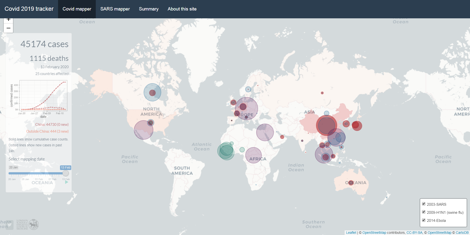
Map & Data: Dr Edward Parker, The Vaccine Centre, London School of Hygiene & Tropical Medicine
Website: Covid 2019 Tracker
Beyond The Map: The Vaccine Centre (VaC)
From The Conversation: In the final weeks of 2019, a virus slipped furtively from animal to human somewhere in the Chinese city of Wuhan. This inauspicious moment marked the sounding of a starting pistol, unheard at first but now echoing deafeningly across the globe. The race to stop a pandemic had begun.
We have been trying to keep up with the novel coronavirus ever since. Each day, we are faced with worrying headlines reporting the latest twists and turns of this outbreak. We have seen the virus spill over China’s borders and spread to at least 25 countries worldwide, and watched with mounting anxiety as the number of cases creeps ever higher. We wait apprehensively to see where the virus shows up next.
At the time of writing, there have been 43,036 confirmed cases of the novel coronavirus and the death toll stands at 1,018. Both of these numbers will be out of date by the time you read this.
In isolation, the daily headlines can be difficult to interpret, offering a static snapshot of a moving target. It is hard, for instance, to tell if the situation is getting better or worse, and to what extent control efforts are having any effect.
To provide a clearer picture of this evolving story, at the London School of Hygiene & Tropical Medicine, we have developed a new outbreak mapping tool.
The site is updated daily based on figures published by the World Health Organization (WHO). While other live trackers developed by Johns Hopkins University and the WHO are updated more frequently, our tool enables users to wind back the clock and view the global situation on any given day of the coronavirus outbreak. It also enables the unfolding situation to be compared with other recent outbreaks, including the epidemic of severe acute respiratory syndrome (Sars) in 2003 (also caused by a coronavirus), the 2009 swine flu pandemic, and the 2014 Ebola outbreak in West Africa.
5 FEBRUARY 2020: Coronavirus 2019-nCoV situation dashboard
SOURCE: WORLD HEALTH ORGANIZATION (WHO)

Map & Data: World Health Organization
Website: Novel Coronavirus (2019-nCoV) Situation Report Dashboard
Beyond The Map: Novel Coronavirus (2019-nCoV) Myth Busters
WHO has developed a dashboard for Novel coronavirus (2019-nCoV) with the number of confirmed cases globally, which includes cases in China by provinces, regions and cities, as well as confirmed cases outside China by country. WHO has prepared a list of Q&A to respond to queries WHO is receiving from various organizations and individuals.
WHO is working closely with global experts, governments and partners to rapidly expand scientific knowledge on this new virus, to track the spread and virulence of the virus, and to provide advice to countries and individuals on measures to protect health and prevent the spread of this outbreak.
Working with technical experts in health operations, WHO operational support and logistics has developed a “2019-nCoV kit”, similar to prepared treatment kits used for outbreaks of other high threat pathogens. In the coming days, the costing, procurement and assembly of these kits will be a priority.
29 JANUARY 2020: Coronavirus 2019-nCoV Global Cases
SOURCE: Johns Hopkins university - center for systems science and engineering (CSSE)

Map & Data: The Center for Systems Science and Engineering at JHU
Website: https://systems.jhu.edu/
Beyond The Map: Mapping 2019-nCoV Blog
Background
On December 31, 2019, the World Health Organization (WHO) was informed of an outbreak of “pneumonia of unknown cause” detected in Wuhan City, Hubei Province, China – the seventh-largest city in China with 11 million residents. As of January 23, there are over 800 cases of 2019-nCoV confirmed globally, including cases in at least 20 regions in China and nine countries/territories. The first reported infected individuals, some of whom showed symptoms as early as December 8, were discovered to be among stallholders from the Wuhan South China Seafood Market. Subsequently, the wet market was closed on Jan 1. The virus causing the outbreak was quickly determined to be a novel coronavirus. On January 10, gene sequencing further determined it to be the new Wuhan coronavirus, namely 2019-nCoV, a betacoronavirus, related to the Middle Eastern Respiratory Syndrome virus (MERS-CoV) and the Severe Acute Respiratory Syndrome virus (SARSCoV). However, the mortality and transmissibility of 2019-nCoV are still unknown, and likely to vary from those of the prior referenced coronaviruses.
GIS Dashboard
In response to this ongoing public health emergency, CSSE developed an online dashboard (static snapshot shown above) to visualize and track the reported cases on a daily timescale; the complete set of data is downloadable as a google sheet. The case data visualized is collected from various sources, including WHO, U.S. CDC, ECDC China CDC (CCDC), NHC and DXY. DXY is a Chinese website that aggregates NHC and local CCDC situation reports in near real-time, providing more current regional case estimates than the national level reporting organizations are capable of, and is thus used for all the mainland China cases reported in our dashboard (confirmed, suspected, recovered, deaths). U.S. cases (confirmed, suspected, recovered, deaths) are taken from the U.S. CDC, and all other country (suspected and confirmed) case data is taken from the corresponding regional health departments. The dashboard is intended to provide the public with an understanding of the outbreak situation as it unfolds, with transparent data sources.
CSSE currently in the process of conducting additional modeling of this emerging outbreak, and will update their blog post with the results soon.